Papers For My Acres
Papers For My Acres is a serialized podcast exploring various matters that connect Black communities, emphasizing history and its impact on our current culture.
[brand still in development]Year: July 2023
Role: Brand Designer/Coproducer
Project Concentration: Brand Identity, Campaigns, Visual Language, Art Direction, Illustration, Podcast Strategy, Social Media Strategy, Copy Editing
Photography: stock image sites and museum digital archives
Key Roles: Creative Direction: Deshawn Oravitz, Social Media Strategy: Devyn Taylor, Coproducers: Samuel Adaramola, Cohost: AJ & Dalin
A Fufu + Grits Original

fudboard/ideation board
Some Background
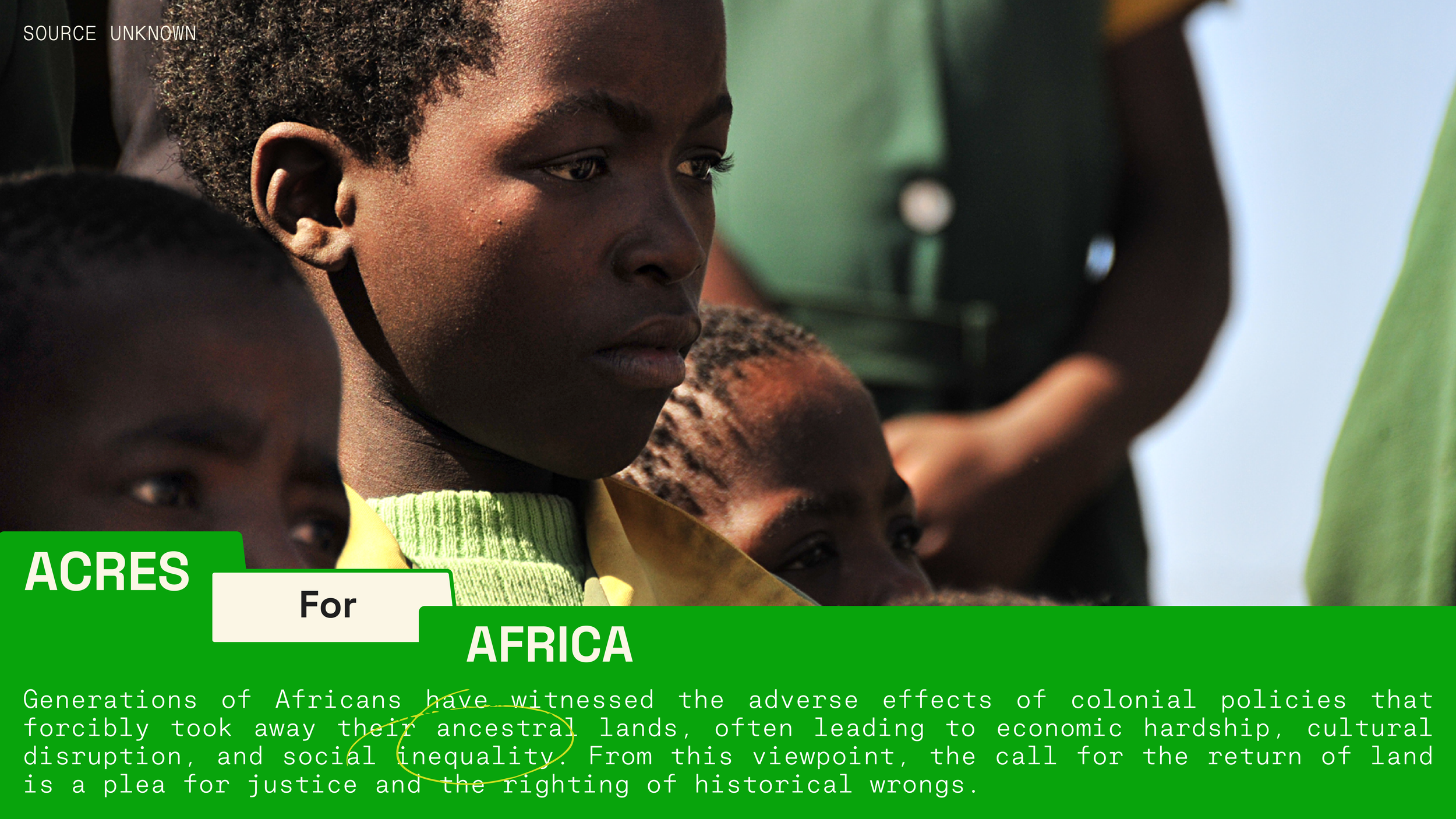
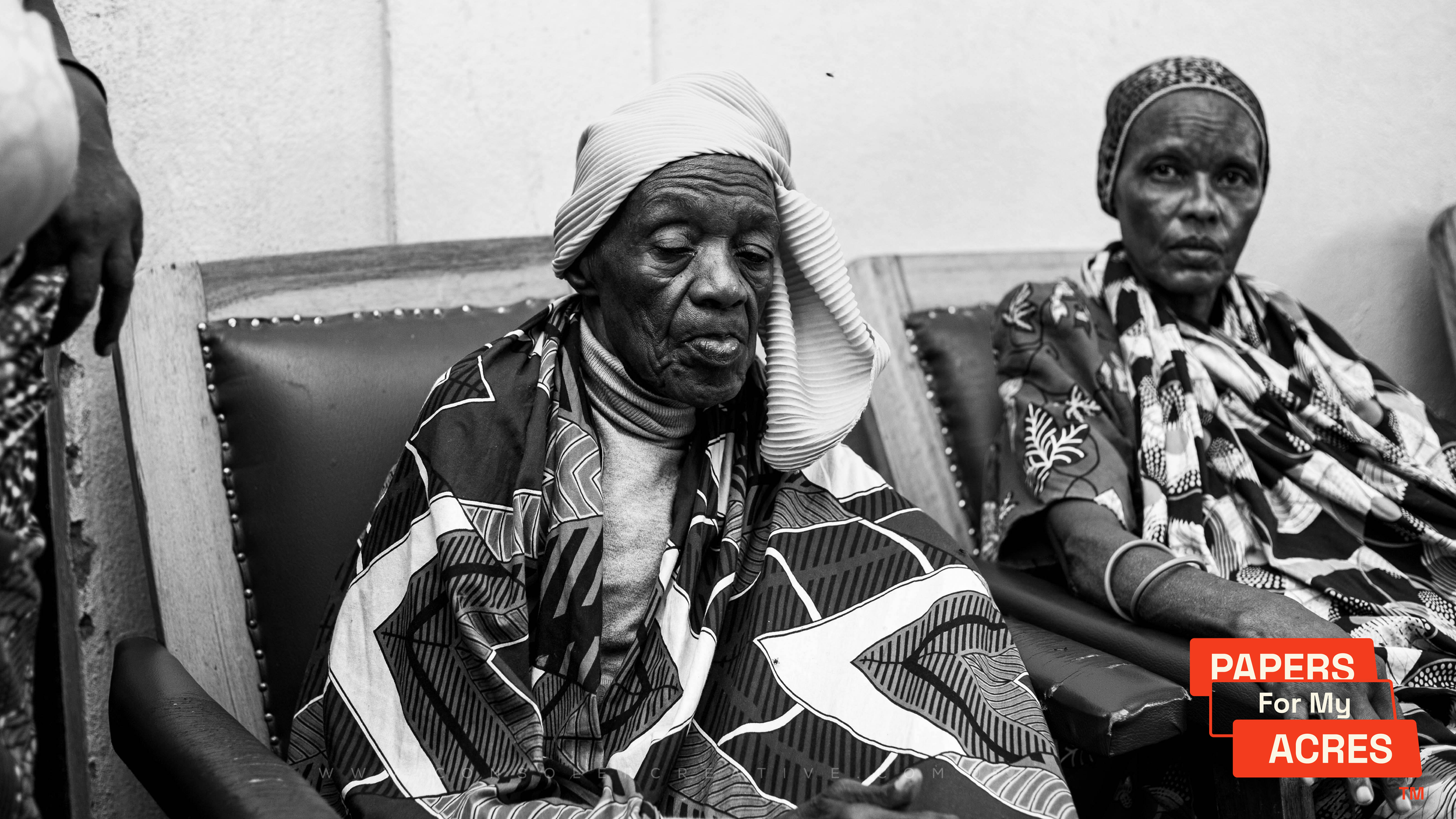
When we say, "PAPERS For My ACRES", we're talking about pulling out the receipts for what are Black history and culture and an expressed desire for reparations for what is owed to us as Black people. And when we say "ACRES For..." we are "giving flowers" to unsung heroes, Black people whose impact in history was overshadowed for one reason or another, and taking the time to pay homage and respect towards their lives.
As a Fufu and Grits original, we recognize the importance of connecting the PFMA brand in a meaningful way. The archival aspects of this branding are pulled directly from the work we've done to build the FF+G photo bank. That archival nature pairs well with the historical non-fiction storytelling of PFMAs content. The collage style of its hand-drawn elements, photography, and type introduces the potential to design from an "out of the box" perspective while the folder tab elements help ground designs within a useful structure.

Design Framework by Creative Director Deshawn Oravetz

Logo Ideating


FILES - primary PFMA LOGO
TAB - scale PFMA LOGO
FOLDER - alt PFMA LOGO
The Papers For My Acres logo takes inspiration from physical folders, specifically archival manila folders. The logo, focusing on the structure of consecutive tabs, incorporates tabs that overlap each other and the top word "PAPER" to visually replicate the tactile experience of searching through folders for information. Because of this structure, 'ACRES' is allowed to take the front stage, which helps balance the paper texture-heavy branding. The rounded edges soften the logo structure and hint at the jovial nature listeners can expect from the tone of the podcast. The "For My" space has a background that can be removed to create a frame for background elements like images, textures, and colors.

SCRATCHES IMPLY REAL-TIME UPDATES OF INFORMATION AND GIVE A PERSONAL TOUCH TO DESIGNS THAT FEATURE LARGE AMOUNTS OF INFORMATION.
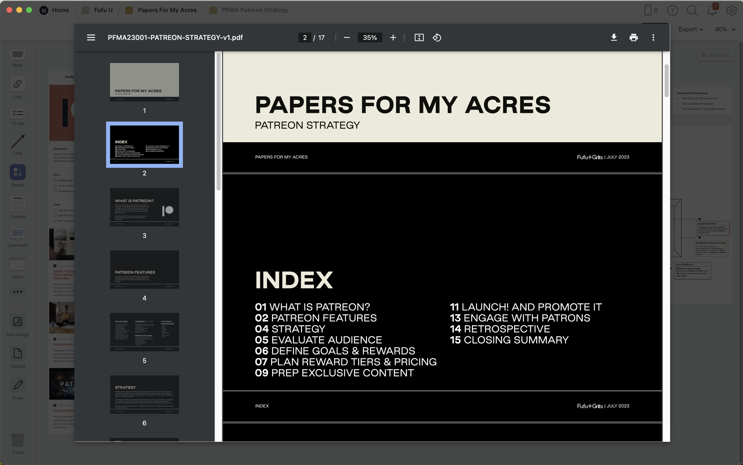
A Patreon strategy was developed to help determine the future Papers For My Acres community's needs and exclusive offerings.
EXPRESSIVE MERCH

BEING SOCIAL